Uber is one of the most recognizable apps in the world. Almost everyone who sees an Uber ad already knows what Uber is, which sounds like an advantage until you're the one making the ads. When a brand is that familiar, the job isn't to introduce it. It's to get people to do something new with an app they already have on their phone.
That's the brief we work on with Uber. As a tech creative agency, we make paid social creative for Uber and Uber Eats, and most of it comes back to one idea: getting people who already use one Uber service to try another, whether that's riders ordering food or Eats customers finding a better deal, and making it feel obvious in a few seconds.
And increasingly, the work isn't just for the US. We make Uber creative for the US, Canada, the UK, France, Mexico, Japan and India. Here's a look at some of our Uber ad campaigns, what each ad is built to do, and what it takes to make one idea work across seven countries.
The Challenge: Advertising an App Everyone Already Has
Most app advertising is about the first download. Uber's is often about the next behavior. Someone who takes Uber rides might never have ordered on Uber Eats. Someone who orders food might not think of Uber for their next trip to the airport. And someone who uses both might still not know there are deals waiting in the app.
That creates a few specific creative problems:
- Familiarity breeds scrolling. A logo people see every day is easy to ignore. The ad has to earn attention with something other than the brand.
- Two apps, one brand. Uber and Uber Eats are separate apps, but riders can also order food right from the Uber app. The creative has to connect the two services without feeling like two ads stitched together.
- The feed moves fast. The message has to land in the first few seconds, with or without sound.
- One idea has to travel. A concept that works in Los Angeles also has to work in Mexico City, Tokyo, Paris and Mumbai, in the local language and with the local app.
- Big brands need volume and polish. The work has to look like Uber, not like a quick template, while still producing enough variations to test on Meta.
Uber Ad Campaign Examples
1. Rides and Eats Together: The Split-Screen Montage
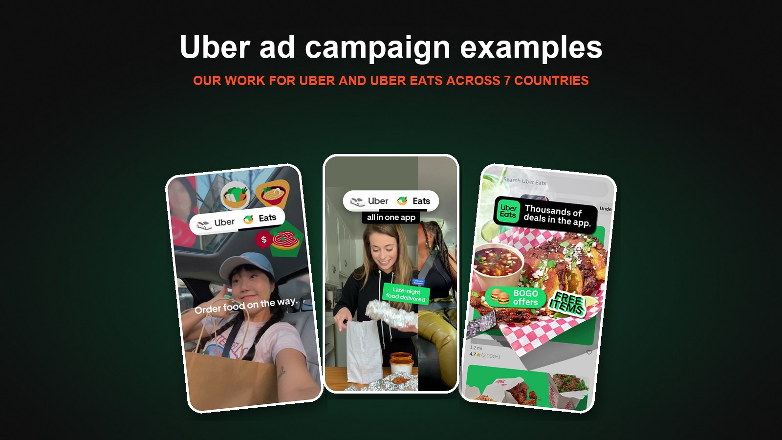
This ad is built to cross-sell. It runs two creator clips side by side and moves fast through everyday moments, each with a short label: "Reliable rides to work," "Late-night food delivered," "Carpool to the game," "Sushi on demand," "Catch your flight," "Coffee comes to you." An "Uber + Eats, all in one app" badge stays pinned at the top the whole time, and it closes on "One app for rides and eats" with both app icons and an "Order Now" button. The point for riders: the app they already use for trips can get them food too.
The format is what we call polished UGC: real creator footage, shot to feel native to the feed, but edited and branded to the standard a brand like Uber needs. The split screen doubles the pace and pairs rides and food moments together, so the viewer sees the whole idea of the app in 15 seconds without a single screen of UI.
2. "Ubering Home? Order Food on the Way": The Storytelling Ad
Where the montage shows breadth, this ad tells one small story. A rider in the back of an Uber asks the question on screen: "Ubering home?" Then the answer: "Order food on the way." We cut to sushi, a green Uber Eats bag being handed off at the door, and someone opening their order at home, under the line "Do it all in one app." It ends on the Uber and Uber Eats icons and "Order Now."
It's the same message as the montage, but framed around a moment almost every Uber rider recognizes. That's the power of storytelling for a familiar brand: you don't explain the product, you show the exact moment it becomes useful. This one is a good example of the UGC hybrid ads we make, where creator footage and designed motion work together.
3. Thousands of Deals in the App: UI Motion
This Uber Eats ad is about affordability, and it's built almost entirely from the app itself. It opens on a scroll through the Offers tab, then the motion takes over. A food photo peels off the screen like a sticker, a "Thousands of deals in the app" badge lands on top, and "BOGO offers" and "FREE ITEMS & MORE" stamps pop in before it ends on bold kinetic type: "Order Delivery On Uber Eats."
For an app, the interface can be the hero, as long as it's designed rather than just recorded. The UI is recognizable enough to feel real, and the motion design turns a list of deals into something worth watching.
Taking Uber Creative Global: One Concept, Seven Countries
A lot of the growth for big consumer tech brands now happens outside their home market, and the creative has to keep up. Our Uber work runs across seven countries: the US, Canada, the UK, France, Mexico, Japan and India. That means the same concept often ships in several languages, including English, Spanish, French and Japanese, with a version built for each market.
Localizing an ad well is a lot more than translating the subtitles. Here's what it actually involves:
- Swapping the app itself. The UI on screen has to match what someone in that market sees on their phone, so a French viewer sees the French app, not the English one with French captions.
- Getting the small details right. Currency symbols, date formats and even punctuation change by market. Japanese subtitles, for example, use their own quotation marks, and whether to include them at all is a style decision the brand makes.
- Knowing when to keep footage the same, and when to change it. Some markets can share the same footage with only the language changed. Others get an adjusted edit so the version feels made for that market.
- Delivering every size for every market. Each version goes out in every placement size Meta needs, and gets reviewed and approved market by market.
This is where an in-house team pays off. The same designers and editors who make the original ad handle every market version, so the concept doesn't lose its polish on the way to Tokyo or Mumbai.
What Working With a Brand Like Uber Teaches Us
A few lessons from this work apply to any well-known app:
- Sell the behavior, not the brand. Everyone knows Uber. The ads work because they focus on a specific action: ordering food on the way home, finding a deal, using Uber for more of the day.
- Moments beat features. "Ubering home?" says more than a feature list ever could. The best hooks come from situations people already live.
- Mix formats on purpose. Polished UGC, storytelling and UI motion each do a different job, and together they give Meta genuinely different creative to test.
- Build for every market from day one. Concepts that rely on local moments, clear on-screen text and swappable UI are much easier to localize than ones built around a single language or joke.
- Polish still matters at scale. A brand like Uber needs creative that feels native to the feed and still looks unmistakably like Uber. That balance is where most of the craft goes.
We've written more about these approaches in how to advertise an app or SaaS product on Meta, including work for Constant Contact, Hometap and Nibbles.
What Uber Says
"Biddyco is cracking a code in the agency model. They balance production and client success without hurting the advertiser's bottom line. They remove the fluff that agency models often bring and focus only on the work that actually yields effective conversion results."
Cristina Azanza, Sr. Manager, Performance Marketing Creative Optimization, Uber
Work With the Team Behind Our Uber Ads
The same in-house team that makes our Uber work makes creative for apps, platforms, fintech and consumer brands spending $100K–$5M+/month on Meta, including localized versions for international markets. We concept, shoot, design and animate UGC, motion and statics built to perform in the feed.
If you're looking for a creative partner for a tech or app brand, see more of our work on our tech creative agency page.